FarmStand
A mobile case study with community and environmental health in mind.
TIMELINE: 3 Weeks
ROLE: UX/UI Designer (Group Project)
TOOLS: Figma, Google Suites
Purpose
Designed with the future in mind, this ecocentric app addresses the lack of connection between local farms and community members. It aims to both enhance farm revenue and elevate community health by implementing a simple search process.
User Research
USER INTERVIEWS: Interviewed both farmers and consumers to determine which flow to focus on and discover the main pain points.
6 user interviews
31 survey responses
PRIMARY OBJECTIVES:
What are a local farmer’s main marketing and financial needs?
What pain points do farmers and consumers have in buying and selling locally farmed produce?
What is the motivation for a consumer to seek out farm stands for the purchase of locally sourced produced?
“... Trying to find people and getting into people’s calendars is tricky...”
-Wes, CSA Manager at Growing Gardens
“I would be more motivated to go to a farm stand if I knew specifically what would be there for meal planning purposes”
-Cathi, Community Member
“I wish there was a place that collectively held information about all localized agriculture news and events that people could access”
Lindsey, Owner of Meant To Bea Florals
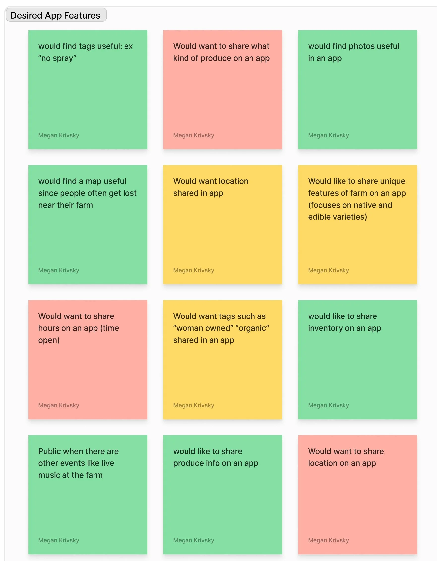
AFFINITY DIAGRAM:
We categorized interview responses in order to enhance our user understanding.
USER PERSONA: Created to represent the farmer using our app, the user persona provided our team with deeper empathy for real life farmers balancing work and life. With this information, we were able to create from a user centric perspective, taking in to consideration how to combine simplicity and effectiveness.
Ideation & Definition
USER INSIGHT: Local farmers with busy work days need efficient ways to advertise to the community in order to create sustainable revenue, enhance customer relationships, and increase value of localized agriculture.
PROBLEM STATEMENT: A mid-scale farmer who does not have marketing assistance needs a simplified and efficient process of communicating with the general public about what, when and where produce is available in order to maximize the community benefits of the farmer’s labor.
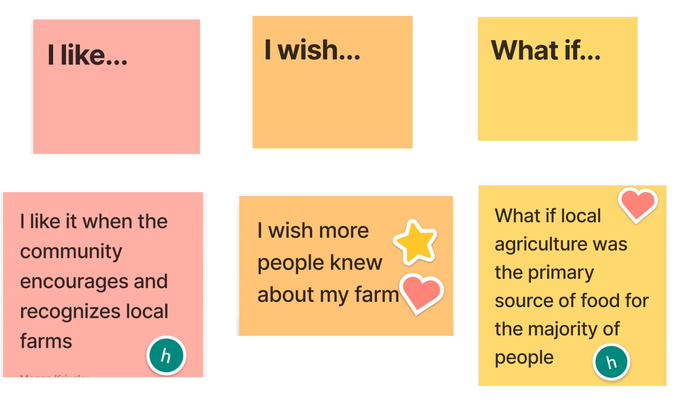
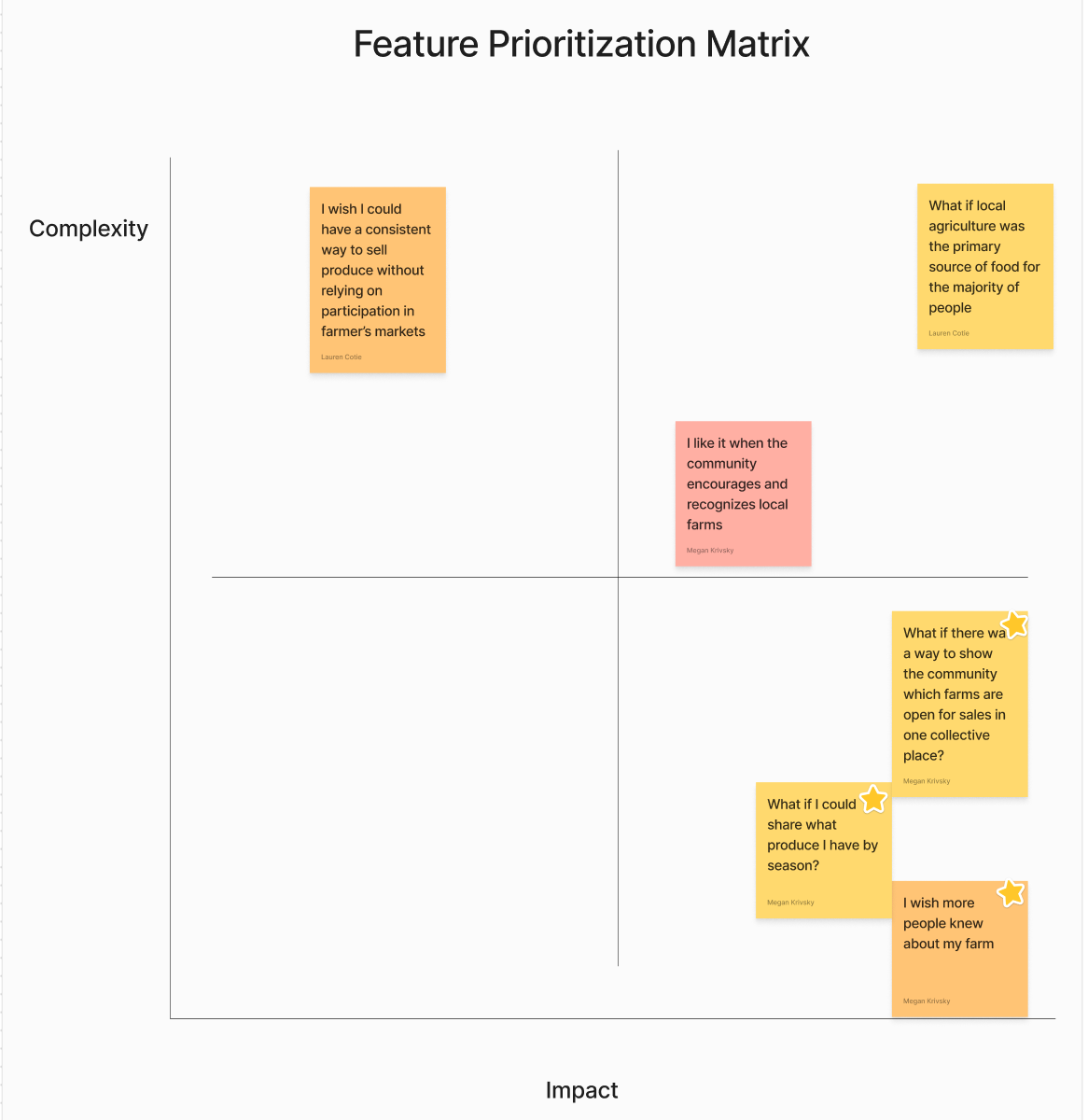
IDEATION: Based on our user research, we created “I like..” “I wish…” and “What if…” statements to ideate on what our app needs to address. Each team member voted on a top statement which provided us with data to create a FEATURE PRIORITIZATION MATRIX, ranking our feature ideas on a scale of complexity and impact.
Features with high impact and low complexity are prioritized.
The main points for our app should address:
Small farm business publicity to the community.
Demonstrating what farms are open on one collective platform.
Allowing farmers to share what produce they are selling by season.
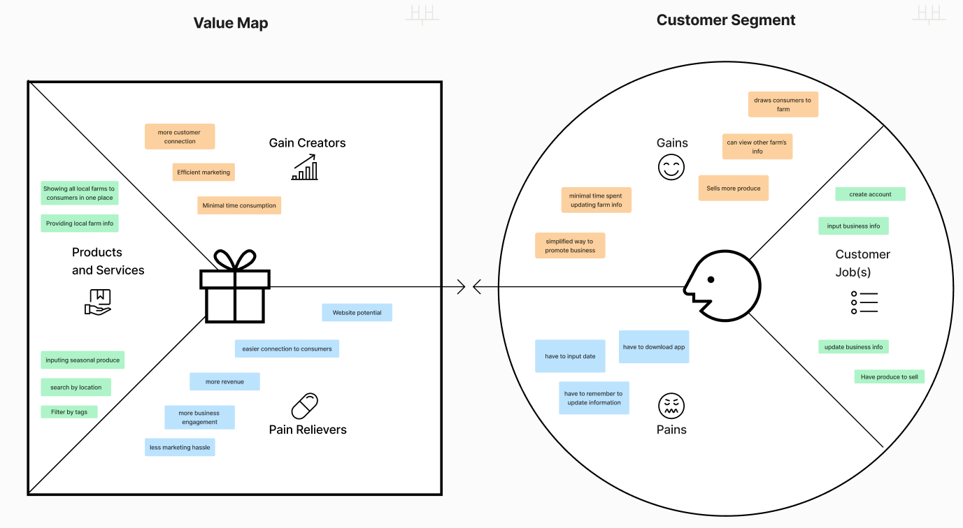
VALUE PROPOSITION: Organized a value map to visualize how our product will help meet the customer needs.
VALUE PROPOSITION STATEMENT:
FarmStand. Local Produce for a Healthier Community.
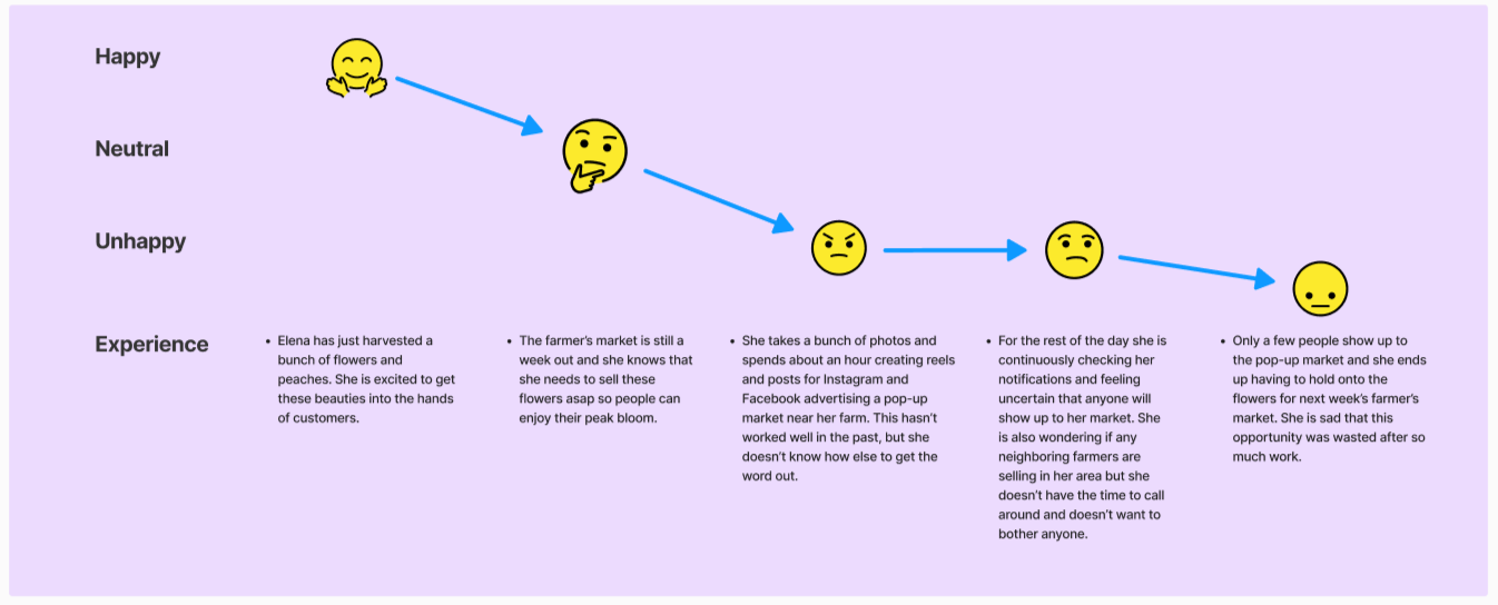
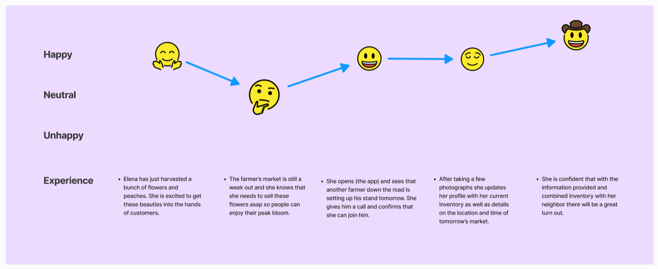
USER JOURNEY MAP: Based on our research and initial ideation, we continued to create a user journey to provide a deeper level of understanding and empathy for our users. This helps us in the initial design process as we are pinpointing addressing user pain points and ultimately meeting the needs and goals of the user.
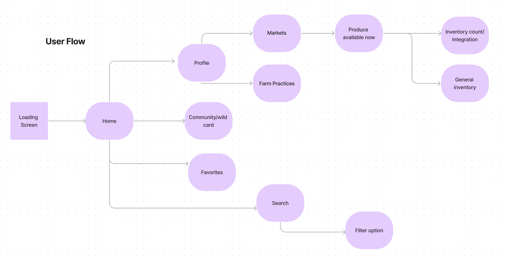
USER FLOW: This helps us identify the user pathway to navigating the app.
Prototyping
Hi-Fi IOS Prototype:
From the mid-fidelity user tests we identified two main pain points:
It was not clear on the home screen where to go to add a market.
On the profile page, users had a hard time figuring out how to edit markets.
Next Steps:
Add micro-animation opening screen
Refine transition animations
Develop consumer flow of searching for markets and saving favorite farms
Farmer verification process
COMPETITIVE ANALYSIS: Our team conducted a competitive analysis of existing apps and platforms with similar visions. We took note of what features work well and what cause user pain points.
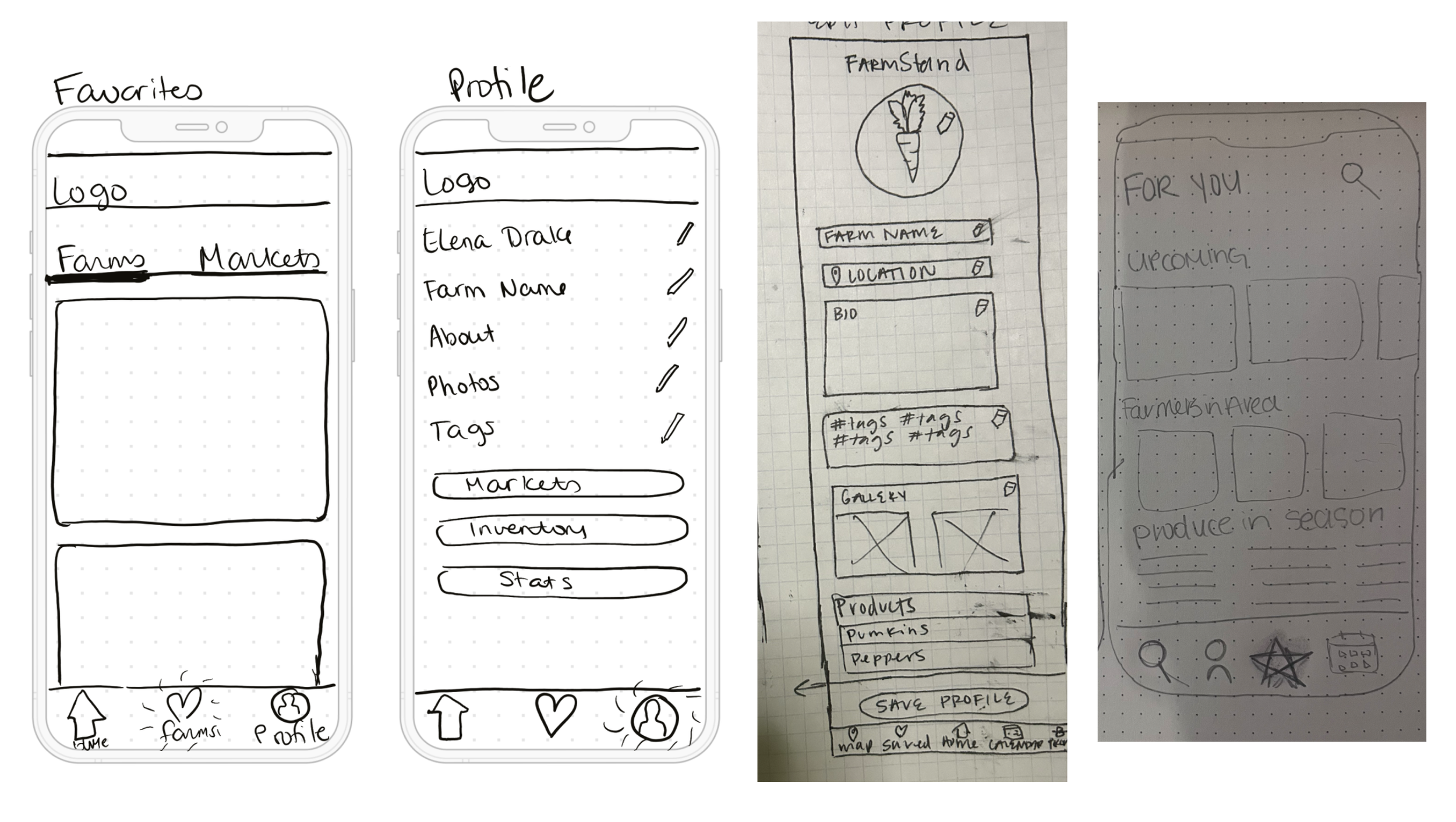
WIREFRAME SKETCHES
DIGITAL LO-FI WIREFRAMES
MID-FI USER TESTING
UI STYLE GUIDE: In preparing for high-fidelity mockups, our team crafted a style guide choosing fonts, colors, images, icons, and buttons for a consistent farm-based theme. We made sure to keep background colors soft and implemented natural colors to convey an earthy theme. We checked all of our contrasts to insure they met Web Content Accessibility Guidelines (WCAG) and took into consideration size of icons and buttons for our target user: community farmers.
TESTING PLAN:
Objectives:
We are wanting to determine the level of ease in adding a market to the app.
We have a high-fidelity prototype of our FarmStand App. We want to make iterations based on user tests.
The objective is to ensure our app is efficient and easy to understand- from a farmer’s point of view.
Questions:
Is this user flow quick and easy for those who don’t have a lot of time to spend on an app?
Will this be useful to farmers?
Is there any information that would be helpful that we haven’t included?
Is the UI consistent and aesthetic?
Testing & Iteration
ITERATIONS: Iterations based on initial user tests included changing key words to create more intuitive design.
“Upcoming Market” was changed to “Update Markets” with an edit icon.
Homepage scrolling errors were fixed.
Time and date form fill iterations.
“Add inventory” iterations.
HI-FI IOS MOCKUPS

