Case Study
C.U.S.P UI Redesign
A user interface redesign to solve for both user and stakeholder pain points and enhance stakeholder goals.

Purpose
TIMELINE: 3 Weeks
ROLE: UX/UI Designer (Group Project)
TOOLS: Figma, Google Suites
This project sought to address the pain points of a local environmental nonprofit, The Coalition for the Upper South Platte, through redesigning the user interface of their website to create a responsive web design that provides an intuitive user interface. This redesign follows UI principles to ensure diverse user compatibility and applies information architecture to prioritize stakeholder needs.
User Research
USER INTERVIEWS
Created a research plan to interview community members on their involvement and experience in nonprofits. Our team also interviewed stakeholders from C.U.S.P to better understand what the organization’s needs and goals are.
Key Stakeholder Quotes: Jeff Ravage, North Fork Watershed Coordinator, CUSP
“...the only organization left that will help people with small acreage get grant funding to do forest mitigation.”
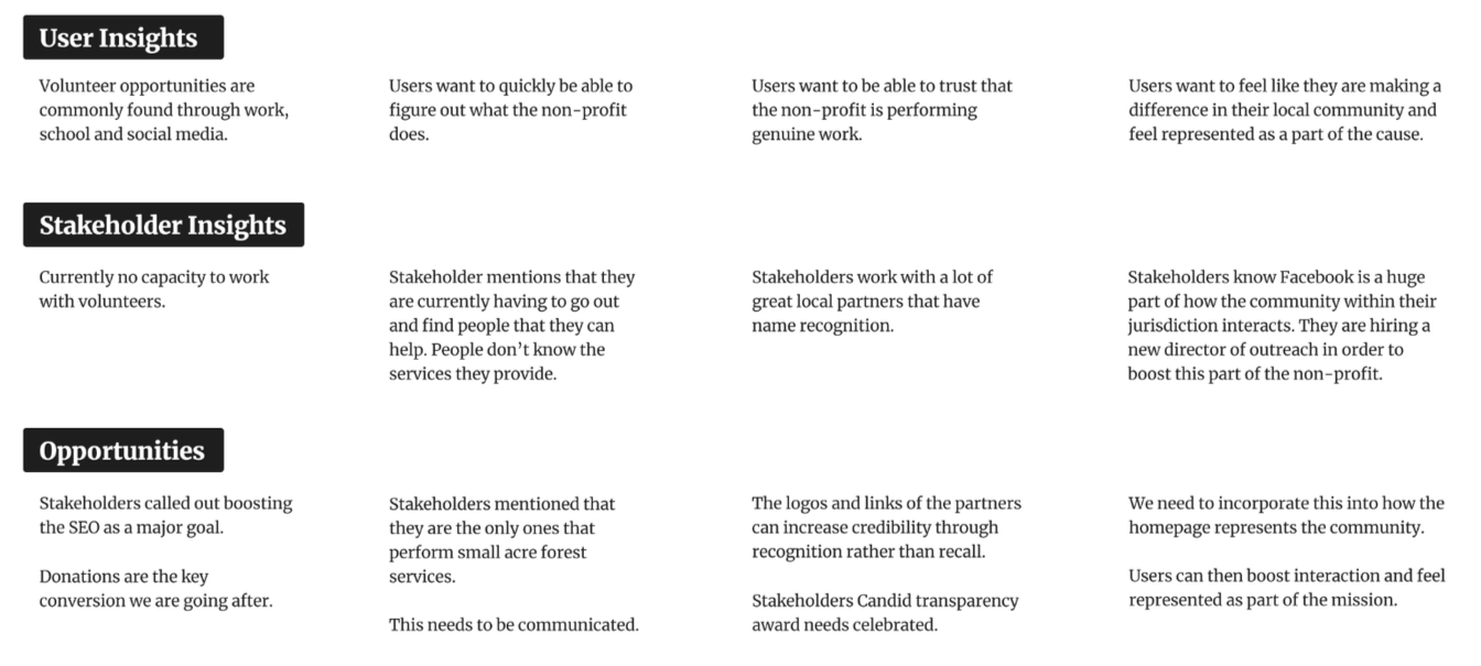
User Insights:
“I’m willing to donate to, or volunteer at, reputable organizations.”
“I donate to nationally recognized non-profits.”
UI Analysis
“...making the website enticing enough again that people would donate on the website.
Our donations on the website are flat.”
“Google search the phrase ‘Environmental Nonprofit Colorado’. We are no longer on the first page. We used to be the top.”
Credibility & Communication
Users need to be able to trust and believe in the non-profit because they are exclusively interested in supporting genuine causes.


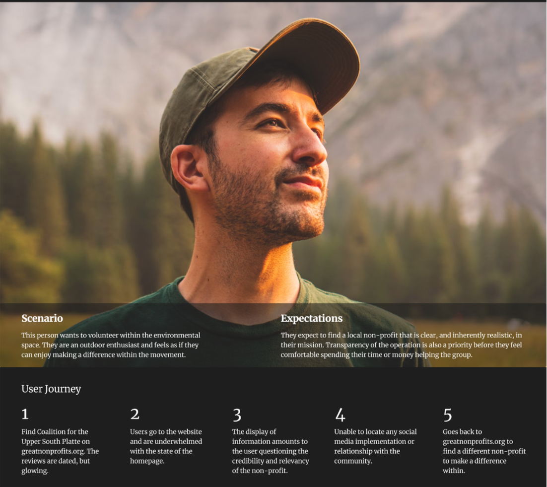
User Persona
Information Architecture

Wireframes
New information architecture based on UX principles:
Miller’s Law: A person can only keep up to 7 items in their working memory.
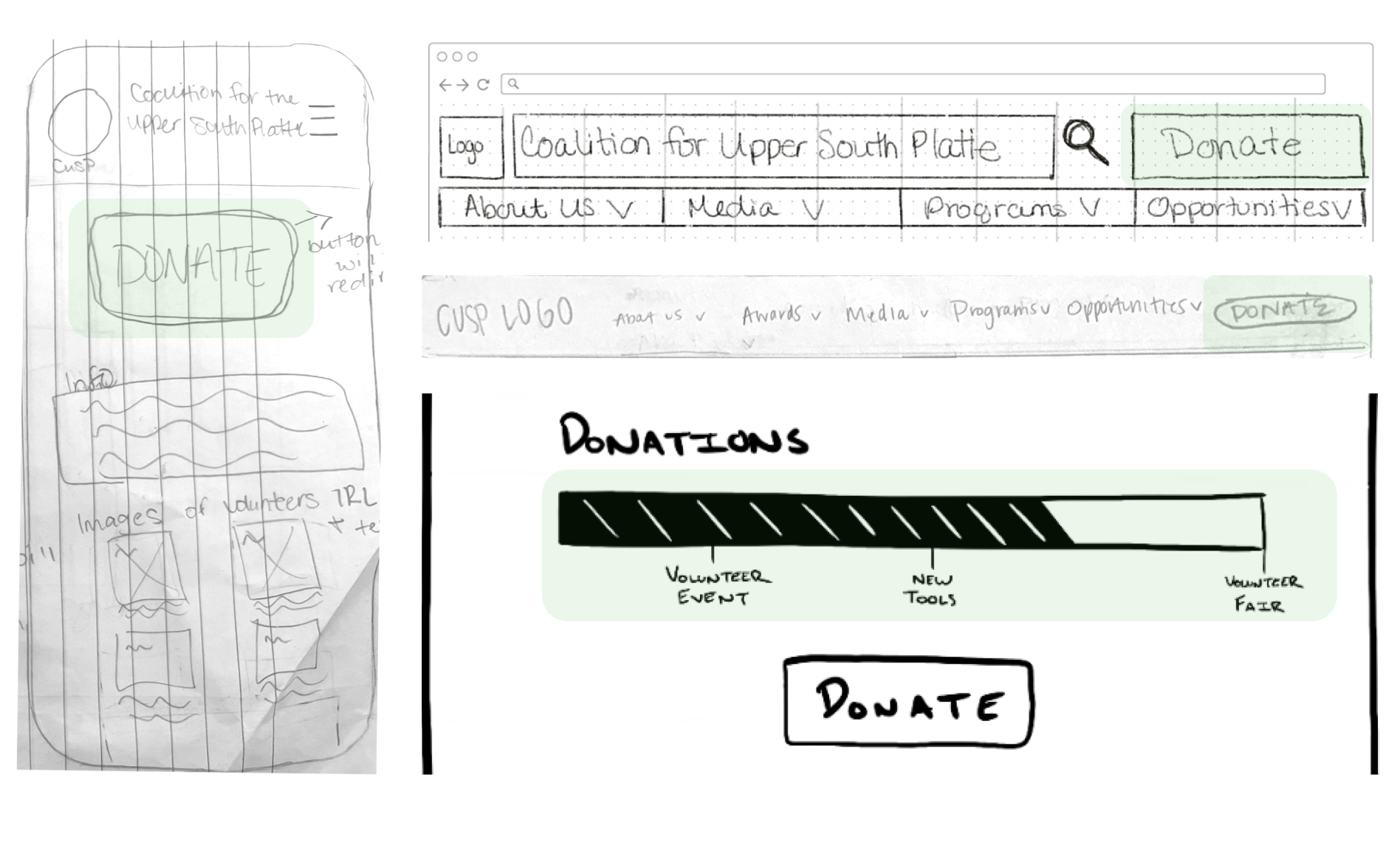
Application: Previously the navigation bar included 8 tabs, we narrowed it down to emphasize the donate button and include 5 tabs with relative sub tabs.
LATCH: Location, Alphabet, Time, Category, and Hierarchy
Application: The original design was not in any specific order. Our team reorganized the navigation bar alphabetically, grouped based on category, and created a hierarchy to put the stakeholders goals first.
Our wireframe sketches revolved around implementing the “4 C’s” into the UI:
Communication - What sets C.U.S.P apart?
Conversion - How do we attract donors?
Credibility - How do we highlight partners to demonstrate credibility and build donor trust?
Community - How do we include social media platforms, such as Facebook, through the user interface?
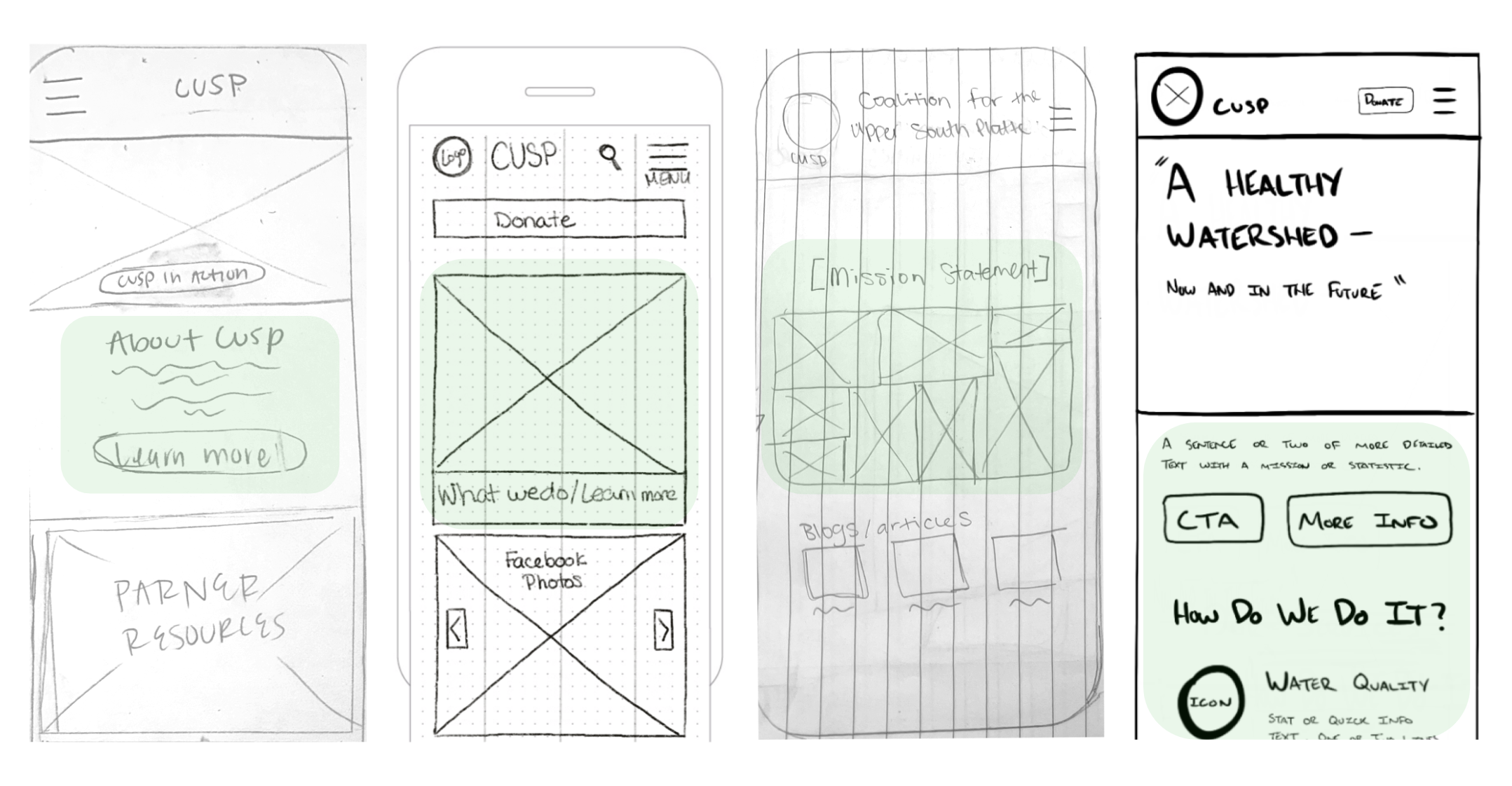
[Figure 1.0] Wireframe sketches across team members highlight communicating to the user what the organization is about, providing users with a clear explanation of of what they are supporting and why it’s worth their time and money.
[Figure 1.1] Prioritizing the stakeholder needs, our initial sketches ensured a “Donate” button was at the forefront of our information architecture.
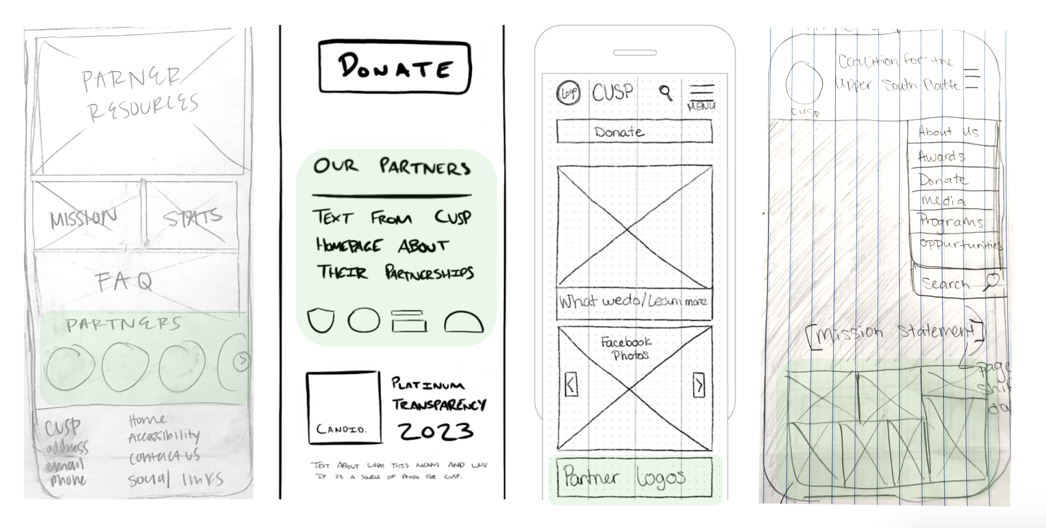
[Figure 1.2] User research indicated that lack of credibility significantly hindered user trust. Our initial wireframes reflected solving this issue through displaying credible partners to further legitimize the organization.

[Figure 1.3] Sketches display social media photos to ensure the website connects users to social platforms.
Mid-Fi Wireframe

UI Style Guide
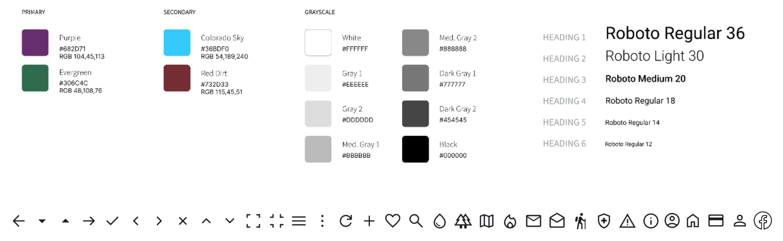
Design Thinking behind the Style Guide:
Chosen colors reflected the existing logo of the company, providing natural, vintage, and earth-based tones.
Roboto, a sans-serif typeface, is a gift to users of the digital world. This font is easy on the eyes, clear, and neutral, allowing users to focus on content without distraction in the user interface.
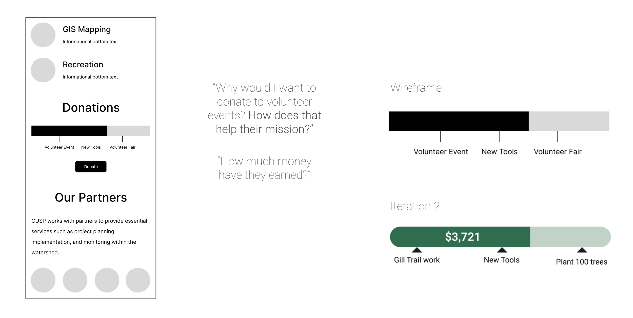
We added a live donation bar that gives users an idea of how much has been donated and what goals are being reached. We wanted to make sure users know their money is making a difference and give tangible outcomes.
Responsive Web Design
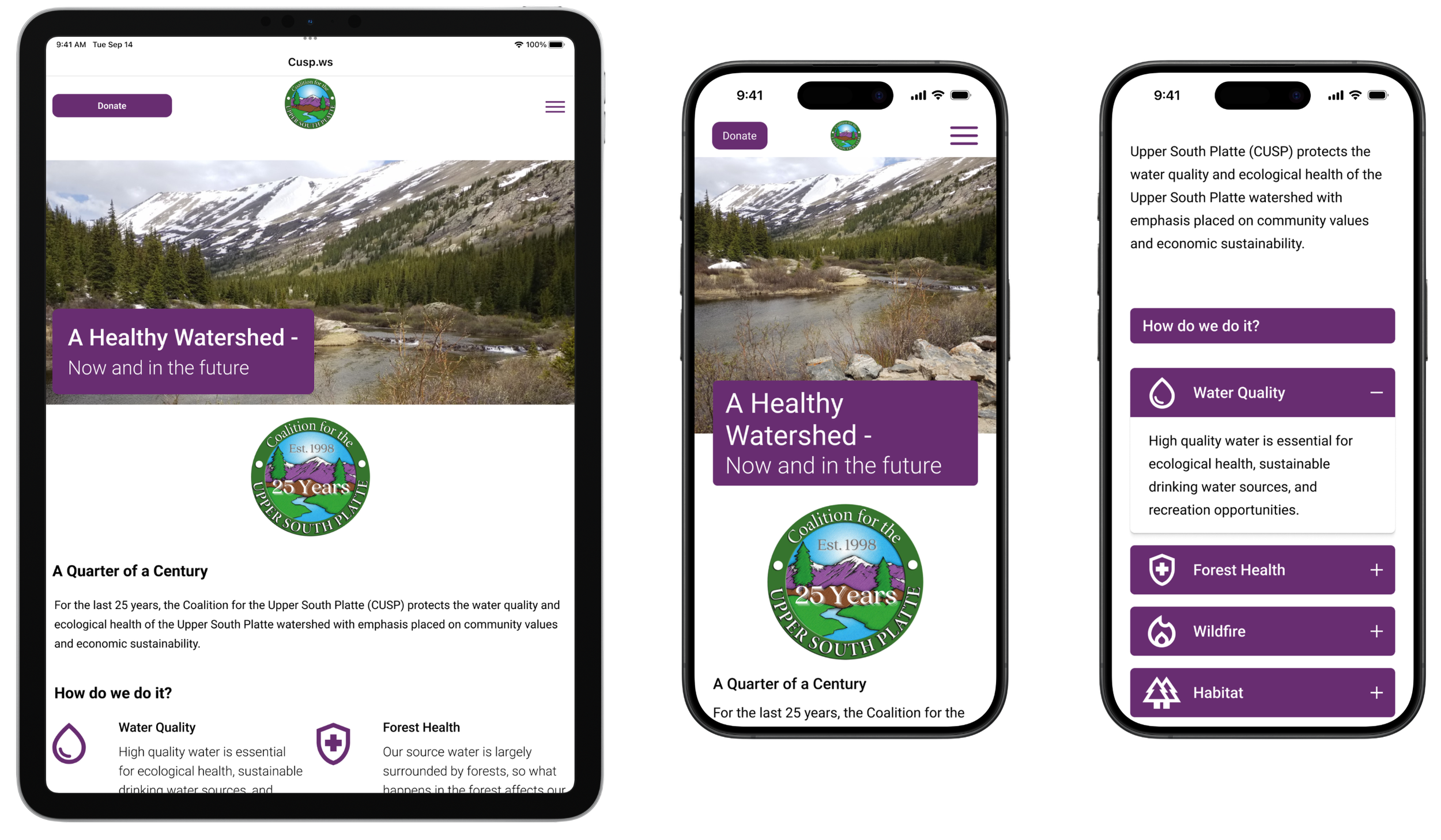
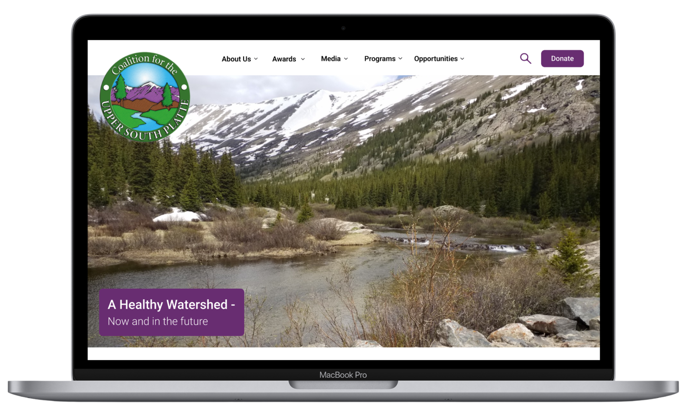
We created a high-fidelity prototype designed across mobile, tablet, and desktop interfaces to provide compatibility in responsive web design.
Accordian Smart Animation

Create components with variants.
Next Steps

Build the frame.

Prototype.
Over the course of research, our goal as a team was to decide which features of the organization we wanted to showcase, while also contributing to an updated version of the site. During this process, we developed the “4C’s”: communication, conversion, credibility, and community. These values helped guide us through our research and design process, in order to satisfy the stakeholders.
Based on the research that we collected, moving forward, our goal is to incorporate an easily accessible blog format within the website. This will allow CUSP employees to keep the website up-to-date, in order to keep users informed.
